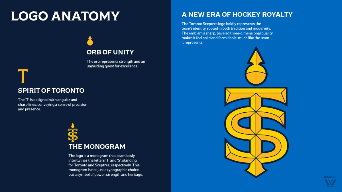
It has been a big week for the PWHL with the announcement of the six franchise names and logos. Toronto’s team was re-introduced as the Toronto Sceptres, adopting a royalty-themed tone and style to its branding. In the league’s social media, Toronto’s name was teased with an image that looked like a queen (possibly Elizabeth I) and the words “almost ready to rule the rink.”
Although many guessed that this signaled a name like the Royals, Queens, or Monarchs, the choice was more subtle – the regal sceptre, “a symbol of power and strength found in courts and palaces,” according to the team’s press release. The ties to the city run even deeper, as they phrased it: “The name ‘Sceptres’ embodies Toronto’s regal history and commanding presence, reflected in the moniker Queen City and iconic places like Queen Street—one of the city’s most culturally vibrant thoroughfares—connecting diverse neighbourhoods and showcasing Toronto’s rich heritage.”
In a placeholder page on their website, Bauer also had three additional names for the PWHL’s six teams, so it appeared that the other possibilities were the Toronto Sentinels or Toronto Tempests.
Although the prominent blue color will remain the team’s primary hue, accents of yellow and gold in the logo add another layer of richness, royalty, and power. The actual emblem has a “T” and an “S” interwoven with an “orb of unity” at the top, representing “an unyielding quest for excellence.” The emblem has a beveled appearance that gives it a jeweled look, and as the marketing outline explains, “makes it feel solid and formidable, much like the team it represents.”
The potential for fans to creatively employ a hockey stick as a sceptre, or for in-game visuals to brandish the sceptre is enticing. Along with the names, the league also trademarked a slogan for each of the six teams. Toronto’s is, “Rise and Reign.”
Team captain Blayre Turnbull spoke in a league press conference and said, “I think the league did a great job picking our name. Obviously, the teaser that was dropped last week indicated that it might have something to do with the queen. I didn’t see too many people guess Sceptres, but there’s a lot of tie-ins to the city, a lot of tie-ins to our team identity and how we want to play and perform on the ice, so overall, I think it’s a very fitting name, and one that our city will really embrace.”
PWHL forward of the year and MVP last season, Natalie Spooner, appeared on Breakfast Television in Canada with League Senior VP of Hockey Operations Jayna Hefford to unveil the name and logo, and said, “It feels so powerful. When you think of royalty and them holding their sceptre, that’s how I’m going to feel holding my stick, like the same sort of power, so I think it’s really a name that as a team we can rally around but also that fans now can rally around. I’m excited to see all the sceptres in the stands. I think it’s such a powerful ornament that royals get to hold, and I think it’s amazing. I’m excited to be a Toronto Sceptre.”
View the original article to see embedded media.
EMEA Tribune is not involved in this news article, it is taken from our partners and or from the News Agencies. Copyright and Credit go to the News Agencies, email news@emeatribune.com Follow our WhatsApp verified Channel


