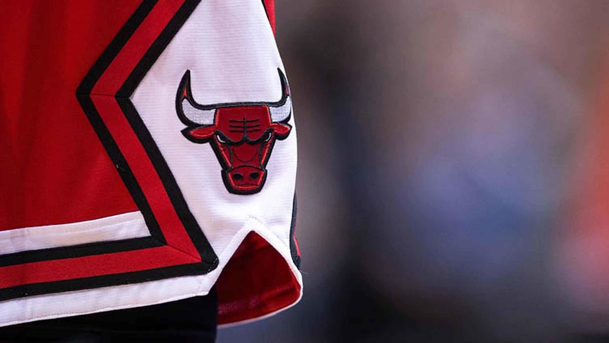
This Bulls logo redesign is going viral on social media originally appeared on NBC Sports Chicago
There is only one team in the NBA that has never changed its logo.
That team is the Chicago Bulls, and there are multiple good reasons as to why that angry red cattle has stood the test of time.
For starters, it’s a fantastic logo. Period. But just because the team will likely never stray from it doesn’t mean graphic artists can’t have a little fun.
TikTok user @emilymorgancreates has gone viral for her impressive logo redesigns over the past couple of years, garnering millions of views for reimagining some of the world’s most popular sports teams while maintaining the heart of the original logo and city.
Most recently, she tried her hand at an updated version of the Bulls logo.
One of the most popular symbols in all of sports across the globe, @emilymorgancreates was wise not to deviate too far from the original concept.
She restructured the bull’s facial features by incorporating the iconic Michael Jordan shrug into the center and added wrinkles to the bull’s forehead using the outline of a basketball. She did, however, make the controversial decision to get rid of the red-tipped horns. Now, all white horns protrude from a slightly rounded bull head.
The rest of the logo remains largely the same with the exception of a few minor geometric details.
All in all, Bulls fans responded positively to the redesign, though nearly everyone agrees the original logo can’t be touched.
Click here to follow the Bulls Talk Podcast.
EMEA Tribune is not involved in this news article, it is taken from our partners and or from the News Agencies. Copyright and Credit go to the News Agencies, email news@emeatribune.com Follow our WhatsApp verified Channel


