In early January, a self-described animation enthusiast from Japan posted about Sailor Moon, the 1990s animated TV series based on the manga of the same name, and ignited a debate over authenticity and aesthetics, especially in the world of anime. Sailor Moon is one of the most popular TV shows Japan has ever produced and it quickly became a worldwide phenomenon.
Several factors have driven Sailor Moon’s success, but one that stands out on TikTok is its aesthetic — which includes an overall pink hue. The concept of fixating on a TV show or film’s aesthetics isn’t new: Fans have for years been making fancam edits — splicing together clips from the source material — and uploading them to YouTube and TikTok. Some of those videos even inspire new viewers to watch the original show or movie.
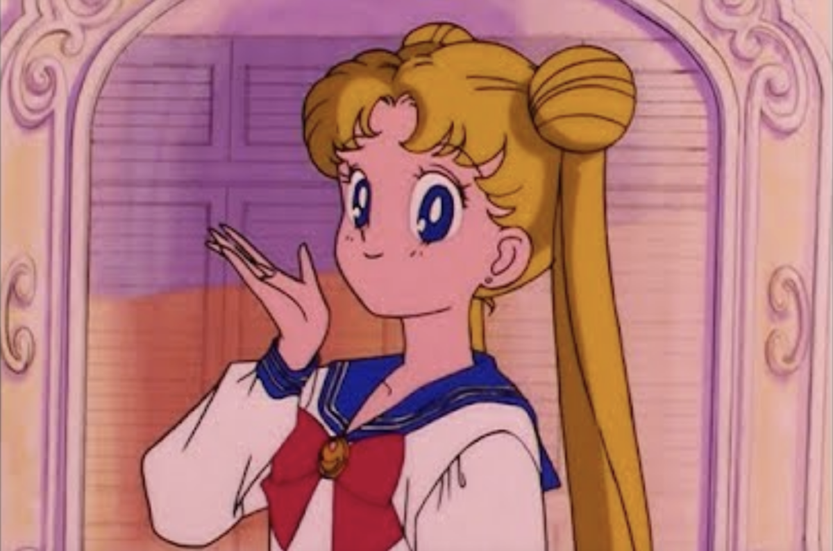
The pink tint to the show has long been beloved as an aesthetic — inspiring countless Tumblr accounts, Pinterest boards, beauty looks and fancam edits on TikTok. But what’s unusual about Sailor Moon’s aesthetic, according to an animation enthusiast on X, is that the beloved pinkish hue of the series is actually a mistake.
Why does Sailor Moon have a pink tint?
“The reason for the colors for Sailor Moon and other Japanese animated shows not being accurate to the original intent of what the animation actually is supposed to look like is largely an issue with Toei Animation,” David Miranda, a film restorer who specializes in anime, told Yahoo News. (Toei Animation is the animation studio behind Sailor Moon and Dragon Ball Z. Miranda does not work for Toei Animation.)
I’ve spoken about the issue briefly before, but yeah, Sailor Moon isn’t supposed to be tinted pink. Like most of the anime of that era, whites are supposed to be white. To prefer 1 or the other is up to you, but keep in mind 1 is objectively incorrect/against the original intent. pic.twitter.com/s004UWeYST
— David Miranda 🦊🇨🇴 (@dubudavid) January 12, 2024
“Toei Animation [in the 2000s] was mostly concerned with digitizing their extensive library, most of which was sourced not from the original camera negatives but rather master positive prints,” Miranda explained. These master positive prints “had faded over time.”
Sailor Moon was one of the shows on film that had faded over time. Toei Animation did not respond to a request for comment from Yahoo News.
“Film is a physical object with chemical properties,” Miranda added. “Eventually, film will start to break down chemically with different types of film fading differently. The film prints used to digitize Sailor Moon in Japan in the early 2000s were all Eastman Kodak [film], which are known for fading pink and red.”
In a post, which was shared on X, formerly known as Twitter, user @kane_hisa wanted to start a conversation about “excessively red tones” in different works of decades-old animation, including Sailor Moon and Spirited Away. He wondered why Sailor Moon fans weren’t upset about the pink hue, since it looks different from how the show originally aired.
Another X user from Japan, @nappasan, quoted the original tweet and doubled down on it, writing: “It’s hard to accept that bright pink tone as if it was the style the creator intended at the time.” They also shared a split-screen clip that showed Sailor Moon after it was syndicated on digital, with the pink hue, and Sailor Moon as it originally aired.
Viewers who didn’t watch the original series when it aired in the ’90s found it to be a massive revelation.
oh my god the pink sailor moon color grading is like the effect of rose-tinted glasses
— Kimbly 🙂 (@PlatitudinousNT) January 13, 2024
I don’t care what the purists say, I like my sailor moon pink !
— Lin (@Liintama) January 12, 2024
on the sailor moon stuff: YES you should acknowledge that the pink tint was unintentional YES you should be angry at toei for failing to properly preserve their media HOWEVER you can still enjoy the tinted animation!!!! the pink adds charm and is what a lot of people know!!!!
— ✨ ender ✨ (@voidicguardian) January 14, 2024
Miranda argued that introducing the whole digital generation to Sailor Moon in the faded film resulted in many fans thinking that’s how the show is supposed to look — which is why a discussion broke out on X over the coloring.
Sailor Moon in pink is cool and all but people gotta understand that people don’t have an issue with it because of that. people are annoyed because Toei has a kinda bad track record with how they preserve stuff for home releases. just look at the green skies in Dragon Ball lol
— Freddy (@kingfreddyyy) January 13, 2024
Is the misconception that ‘Sailor Moon’ has a pink hue an example of the Mandela effect?
The Mandela effect refers to situations where large groups of people collectively share a false memory or incorrectly remember something. One of the most famous examples in pop culture is the spelling of “The Berenstain Bears,” which was often thought of as being written as “Berenstein.”
For Sailor Moon, it’s not a Mandela effect situation because the pink hue comes from film deterioration. A similar color issue happened with the anime Dragon Ball Z, a Japanese animated show that aired in 1989.
“There is nothing wrong with any interpretation of art, but I do want to make it clear that it must be understood that this is a product of poor preservation, which is a problem,” Miranda said. “What spun off of this sure created an interesting aesthetic with regards to how people interpret anime from the era, but it is not an authentic one, and from a historical and preservationist perspective, I don’t agree that it should be quite as celebrated as it is.”
EMEA Tribune is not involved in this news article, it is taken from our partners and or from the News Agencies. Copyright and Credit go to the News Agencies, email [email protected] Follow our WhatsApp verified Channel